
Font creation
The font is what turns visagrafía® into text: with it installed, the characters the keyboards write show as ideograms in any program. VisaSoft Studio generates the font directly from the vectors of the collection, with no manual steps, and regenerates it whenever something changes. This page explains how it does it, why the glyph page is decisive and what every option of the export dialog means.
What is inside the font
The font of a locale is a TrueType file (.ttf) with:
- one glyph per concept (per sign) that has an ideogram in the locale, tied to its Unicode Private Use Area character (
U+E000onwards; every concept's code point is fixed forever); - one glyph per grapheme of the collection, from
U+F800in name order, which the keyboards use to draw their palettes offline (they are display glyphs; they are never written in a text); - the
.notdefglyph and the space; - the metrics: 1,000 units per em, ascent 800, descent 200;
- an OS/2 table valid for GDI (classic Windows): without it the Windows keyboard's candidate window would show empty boxes.
Only the live versions go in: whatever sits in a working copy or in an unpromoted version does not exist for the font.
How every glyph is built
- The ideogram is drawn exactly as in the editor: every reference resolves to its grapheme (live or pinned), and position, scale, rotation and thickness are applied.
- The Bézier curves are flattened into polylines.
- Strokes become outlines: every stroke is expanded by half its thickness on each side, with round caps and joins. Filled shapes are taken as polygons (thickened if they carry a thickness ×).
- All shapes are merged into a single geometry, so overlaps produce no holes under the fill rule.
- The geometry is written as TrueType contours of straight segments.
- The glyph's advance width (how far the cursor moves) is the right end of its ink plus 40 units; the left side bearing is its left end.
Since on the canvas one unit is one font unit and the canvas origin is the font origin, the ideogram's coordinates go as they are into the glyph. There is no intermediate scale or offset: what you see in the editor with the page shown is what the character will take up.
Why the page matters
The editor's glyph page is the font's em square: a square of 1,000 units whose bottom-left corner sits 200 units below the origin.
| Zone | Coordinates | What happens to ink that falls there |
|---|---|---|
| Inside the page, above the baseline | x 0–1,000, y 0–800 | The normal body of the character: at 72 px the page measures 72 px. |
| Descender | y −200 to 0 | Hangs below the baseline, like the tail of a g. Right for what really hangs; the corpus reaches −330. |
| Above 800 | y > 800 | Sticks out at the top: invades the previous line in a multi-line text and may be clipped by programs that do not honour the real height. |
| Left of 0 | x < 0 | Overlaps the previous character. By rule of the collection, no ideogram starts left of 0. |
| Right of 1,000 | x > 1,000 | The glyph is wider than an em: the advance grows and the ideogram "takes more room" than its neighbours. |
The practical consequences follow:
- Size: an ideogram that fills the whole page shows at the body size of the text; one that fills half shows at half. For a text to be even, ideograms must have comparable sizes: the editor's percentile frames show exactly where 50 %, 75 % or 90 % of the collection fits, and that is the frame to compose in.
- Vertical alignment: every ideogram shares the baseline. One drawn higher than the rest "floats" on the line; one with much ink below the baseline collides with the gloss written underneath (that is why the text editor leaves extra room under ideograms in font mode).
- Horizontal alignment: since all start at x = 0, the left margin is uniform and the spacing between ideograms depends only on their width plus the 40 units of air.
- Thickness: stroke thickness is kept in font units; at small sizes, an 18.75-unit stroke (the default) measures less than 1 px at a 40 px body. Very thin strokes vanish on screen and very thick ones close the gaps.
The Export font dialog
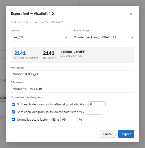
It opens from the collection detail (Export font… button) or from File → Export font…. It needs the export font permission on the collection and at least one ideogram. Exporting is a publishing step, not an editing one, which is why it lives in the detail and not inside the editor.
Locale
The locale whose font is generated. Every locale produces its own font, because the same concept may have a different ideogram in each and because the family name carries the locale so that they can all be installed at once.
Unicode range
Which concepts go in, by code point:
| Option | Range | When to use it |
|---|---|---|
| Private Use Area (E000–F8FF) | The Private Use Area of the basic plane. Default: holds every concept of the corpus (6,400 positions) and the grapheme glyphs. | Always, except special cases. |
| Supplementary PUA-A (F0000–FFFFD) | Plane 15. | Only if a corpus grew beyond the basic plane. |
| Basic Multilingual Plane (0000–FFFF) | The whole basic plane. | Same as the first for the current corpus. |
| All codepoints | No filter. | Same. |
| Custom range… | Two hexadecimal fields From and To. | To generate a partial font: for instance only the first hundred concepts for a test, or a subset for teaching material. |
The figures panel updates live: will export (ideograms in the range), in the locale (the locale's total) and the range in hexadecimal. If no ideogram falls in the range, the export button is disabled and a warning shows.
Font name
The family name programs will show in their font menus. "Collection locale" is proposed (for instance VisaSoft 4.0 es_CO); you may change it, and from then on the dialog stops overwriting what you typed. That same "collection locale" name is what the keyboards and the text editor use to tell the faces of a locale apart: a language package of another collection installs on the keyboards as one more face of the same locale, and sent messages carry the name of the face they were written with. The PostScript name is derived by dropping spaces and symbols. Every locale should have a distinct name so the fonts coexist installed; and successive versions should keep the name, so documents already using it switch to the new font unchanged.
File name
The name of the downloaded .ttf. It is proposed from the family name and must contain the locale (the field turns red otherwise): the fonts of two locales can never be mixed up that way. If it does not end in .ttf, that is appended; characters invalid in a file name become _.
Normalize the ideograms
Three optional adjustments that rewrite the geometry of every glyph separately when the font is generated, without touching the collection. They yield a uniform font from a corpus drawn with uneven criteria.
| Option | What it does | Parameter |
|---|---|---|
| Shift each ideogram so its leftmost point sits at x = | Moves the glyph horizontally until its ink starts exactly at the given value. Fixes uneven left margins. | Value in font units, −100 to 100; 0 by default (the em's edge). |
| Shift each ideogram so its lowest point sits at y = | Moves the glyph vertically until its lowest ink sits at the given value. With 0, every ideogram "rests" on the baseline; with a negative value, all hang the same. Removes each drawing's natural descender. | Value in font units, −100 to 100; 0 by default. |
| Normalize scale factor | Scales the glyph with the same factor on X and Y (keeps the proportion) until its ink fills the em (1,000 wide, 1,000 tall between −200 and 800), times the filling percentage. Evens out the size of every ideogram: small ones grow and large ones shrink. | filling: 80 to 120 %; 95 % by default, to leave air between adjacent ideograms that fill the whole width. 100 % touches the edges; over 100 % overflows on purpose. |
| Only ideograms that do not fit | Restricts the scaling above: only ideograms larger than the box are shrunk; those that already fit keep their size and, when the shifts are ticked, are just moved to the origin. Fixes the oversized ones without touching the relative size of the rest. | Checkbox, available once Normalize scale factor is ticked. "Fitting" is measured against the box already multiplied by filling. |
When any of the three is on, every glyph's advance is computed from its normalized ink. The three combine: scale first, then position. With all three ticked and the default values, every glyph of the font takes exactly the same box, 0 to 950 wide and 0 to 950 tall.
The section Normalization in pictures shows the effect of each setting on twenty ideograms of the corpus.
| Situation | Recommendation |
|---|---|
| Reading font from a well-composed collection (the reference corpus) | No normalization: the relative size each sign was drawn at is respected. |
| Well-composed collection except for a few ideograms that overflow the page | All three, with Only ideograms that do not fit: relative sizes are respected and only the ones invading the neighbouring lines shrink. |
| Collection drawn by several people at uneven sizes | Normalize scale factor at 95 % and lowest point at y = 0. |
| Font for palettes, keys or tables where every ideogram must fill its cell | All three, at 100 %. |
| Text font where nothing may hang below the gloss | Lowest point at y = 0 and, if needed, scale. |
Export
The Export button asks the server for the font and the browser downloads it under the chosen name. The first generation of a large locale takes a few seconds; the next ones with the same parameters are immediate, because the server keeps the font and only regenerates it when a live version changes (the fingerprint of all live content travels as an ETag). The notice "Exporting n ideograms for locale…" confirms the start.
Normalization in pictures
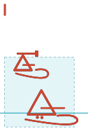
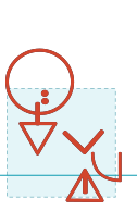
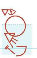
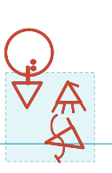
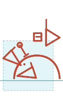
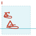
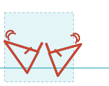
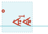
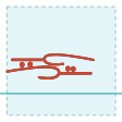
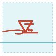
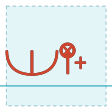
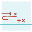
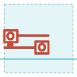
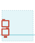
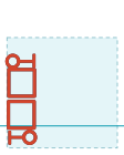
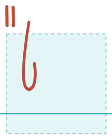
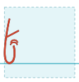
Twenty ideograms of the reference corpus, chosen because they are its extreme cases: five oversized ones (taller than the page), five wide, five short and five thin. Every table carries the word in its first row (in Spanish, the language of the corpus) and, below it, the same ideogram exactly as it comes out of the font under three settings of the dialog:
- Not normalized: no box ticked. Every glyph keeps the size and position it was drawn with.
- Only those that do not fit: the three boxes ticked with their default values (x = 0, y = 0, filling 95 %) plus Only ideograms that do not fit. The ones that overflow are shrunk; the rest are just moved to the origin.
- All: the three boxes, without that restriction. Large ones shrink and small ones grow, until the longer side of each measures 950 units.
Every cell is drawn at the same scale, so sizes can be compared across rows and across tables. The dashed frame is the glyph page (the 1,000 × 1,000 em), the solid line is the baseline, and ink that falls outside the page is painted red. The number under each cell is the scale factor the ideogram received. So that they read well at this size, every figure in this section is drawn with one and the same stroke, thicker than the font's; the size and position of every ideogram are exactly those of the generated font.
| constancia | fuente | papa francesa | cascada | signos |
|---|---|---|---|---|
| 1 · Not normalized | ||||
 |  |  |  |  |
| 2 · Only those that do not fit | ||||
 ×0.55 ×0.55 | 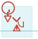 ×0.68 ×0.68 | 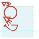 ×0.60 ×0.60 | 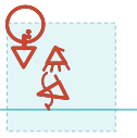 ×0.64 ×0.64 | 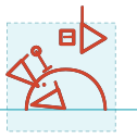 ×0.80 ×0.80 |
| 3 · All | ||||
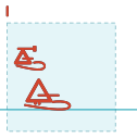 ×0.55 ×0.55 | 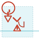 ×0.68 ×0.68 | 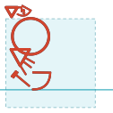 ×0.60 ×0.60 | 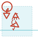 ×0.64 ×0.64 | 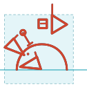 ×0.80 ×0.80 |
| despreciar | alto | español | tío | mariposa |
|---|---|---|---|---|
| 1 · Not normalized | ||||
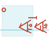 | 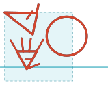 | 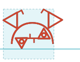 | 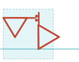 |  |
| 2 · Only those that do not fit | ||||
 ×0.65 ×0.65 | 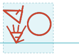 ×0.78 ×0.78 | 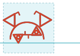 ×0.81 ×0.81 | 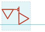 ×0.84 ×0.84 | 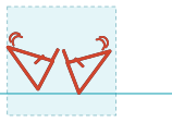 ×0.85 ×0.85 |
| 3 · All | ||||
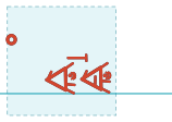 ×0.65 ×0.65 | 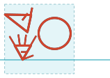 ×0.78 ×0.78 | 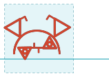 ×0.81 ×0.81 | 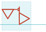 ×0.84 ×0.84 | 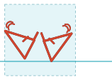 ×0.85 ×0.85 |
| juicioso | por la tarde | exclamar | guerra | ventana |
|---|---|---|---|---|
| 1 · Not normalized | ||||
 |  |  |  |  |
| 2 · Only those that do not fit | ||||
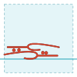 ×1.00 ×1.00 | 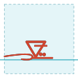 ×1.00 ×1.00 | 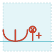 ×1.00 ×1.00 | 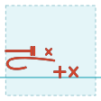 ×1.00 ×1.00 | 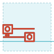 ×1.00 ×1.00 |
| 3 · All | ||||
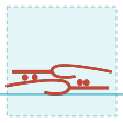 ×1.19 ×1.19 | 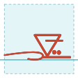 ×1.37 ×1.37 | 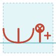 ×1.20 ×1.20 | 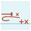 ×1.18 ×1.18 | 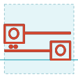 ×1.46 ×1.46 |
| casado | enero | caballo | hambre | baño |
|---|---|---|---|---|
| 1 · Not normalized | ||||
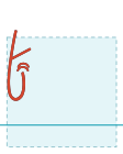 | 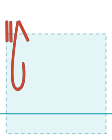 |  |  |  |
| 2 · Only those that do not fit | ||||
 ×1.00 ×1.00 | 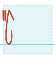 ×1.00 ×1.00 | 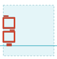 ×1.00 ×1.00 | 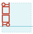 ×1.00 ×1.00 | 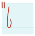 ×1.00 ×1.00 |
| 3 · All | ||||
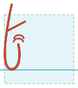 ×1.51 ×1.51 | 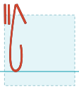 ×1.38 ×1.38 | 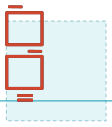 ×1.61 ×1.61 | 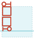 ×1.18 ×1.18 | 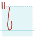 ×1.13 ×1.13 |
The three options, side by side
The same twenty ideograms set as one line of text: one line per setting, all three at the same body size, smaller than in the tables so that the twenty fit on a single line. Every glyph follows the previous one by its advance width, as in a document, with its word underneath. The band is the font's line height (from the descent, −200, to the ascent, 800), with the baseline and a tick where every character starts; ink that leaves the band is red.
| 1 · Not normalized |
|---|
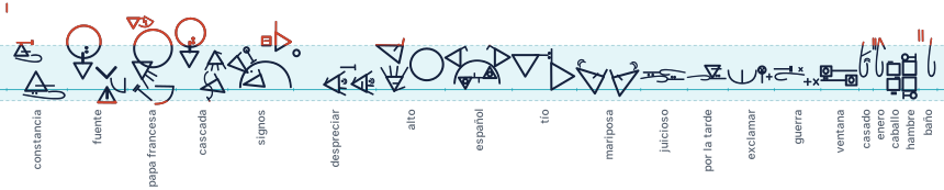 |
| 2 · Only those that do not fit |
 |
| 3 · All |
 |
The length of the line changes too: not normalized, the twenty ideograms take 16,786 units; with only those that do not fit, 13,780 (18 % less, because the oversized and the wide ones shrink and nothing grows); with all, 15,205 (9 % less: what those give up is partly taken back by the short and the thin ones as they grow).
What to look at
- Not normalized, the size is that of the drawing: constancia is 1,719 units tall, almost two pages, and invades the line above and the gloss below; despreciar is 1,458 wide and takes the room of an ideogram and a half; juicioso is 225 tall and floats in the middle of the line; casado is 201 wide. Within one text, some ideograms are up to seven times taller than others.
- With only those that do not fit, the oversized and the wide ones shrink just enough to fit the 950 box (constancia × 0.55, despreciar × 0.65) and the short and thin ones stay at × 1.00: they do not change size, they only drop to the baseline and move to the left margin. The size hierarchy among all the ideograms that already fitted is preserved.
- With all, the small ones grow too: casado × 1.51, caballo × 1.61. Now every glyph touches the 950 box with its longer side, and the font looks even.
- The proportion never changes. The factor is the same on X and Y, so a short ideogram stays short and a thin one stays thin: juicioso grows only × 1.19, because at 950 wide it already touches the box, and it stays 268 tall. Normalization evens out the longer side, not the area.
- Stroke weight scales with the drawing. An ideogram shrunk to × 0.55 ends up with strokes half as thick, and one enlarged to × 1.6 with strokes noticeably thicker than its neighbours'. That is the price of normalizing in the font instead of redrawing in the editor. The figures do not show it, precisely because they use a uniform stroke.
- The red left in the normalized rows is intentional: with y = 0 the normalization box rests on the baseline and spans 0 to 950, that is, 150 units above the font's ascent (800). If the font must respect the line height, lower filling to 80 % (the tallest glyph then reaches exactly 800) or use y = −100 to split the excess between top and bottom.
After exporting
- Try it without installing: in the text editor, Format → Load a font to try draws the document with the file you just downloaded.
- Install it: on Windows, right-click → Install (or Install for all users); on macOS, open it with Font Book; on Linux, copy it to
~/.fontsand runfc-cache; on Android, the keyboard carries its own font and nothing needs installing. - Publish it on the Downloads page so others can install it (administrators only).
- If you changed ideograms, regenerate the locale package (Downloads → Download locale package) for the keyboards: the package carries the font inside.
Frequently asked questions
Why does my new ideogram look huge (or tiny) in the text? Because it was drawn outside the usual size: compare it with the 75 % frame in the editor and rescale it. Or generate the font with Normalize scale factor.
Why does the ideogram overlap the line above? It has ink above y = 800. Lower or shrink it until it fits in the page.
Why does the gloss under the ideogram collide with it? It has a lot of ink below the baseline. Raise it, or export with lowest point at y = 0.
Do the characters change when the font is regenerated? No. Every concept's code point is fixed: a text written with yesterday's font reads with today's.
Can I have two versions of the font installed? Only if they have different family names; otherwise the last one installed replaces the previous one.