
Ideogram editor
The ideogram editor composes an ideogram by placing graphemes on the glyph page. It opens with a click on an ideogram in the browser and takes one tab per ideogram.
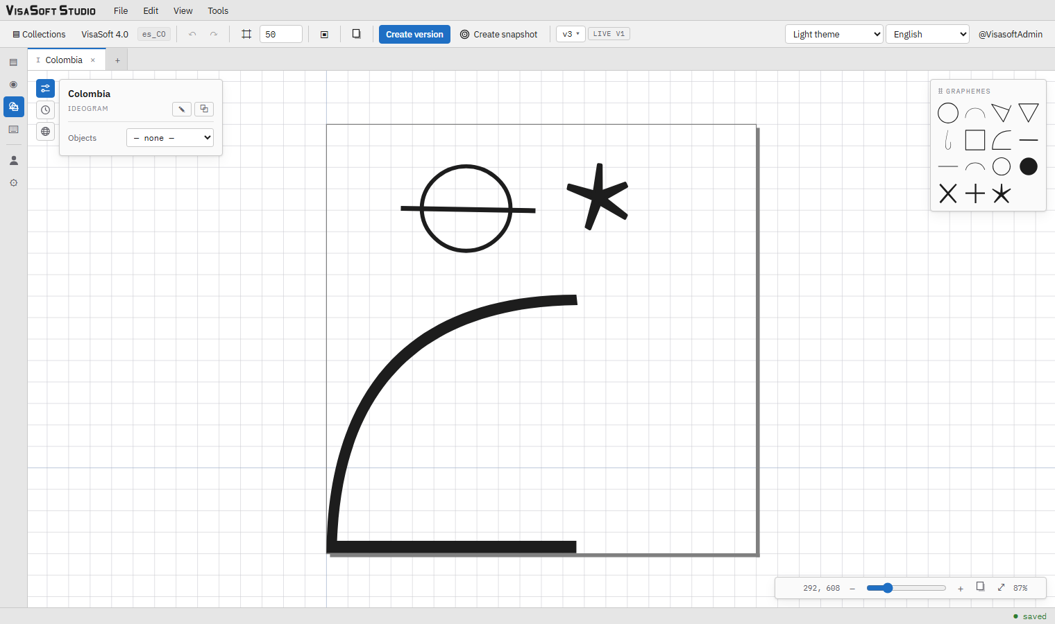
Parts of the editor
- Toolbar (top): undo/redo, grid and its size, percentile frames, glyph page, Create version, Create snapshot, the version picker and the LIVE badge. Described in the toolbar.
- Canvas: the drawing area with the grid, the origin guides and, when shown, the page and the frames.
- Properties panel (top left): the ideogram's name, the ✎ Rename and ⧉ Clone buttons, and three switchable boxes: Ideogram (properties), History (versions and snapshots) and Localized names.
- Grapheme toolbox (floating): one button per grapheme of the collection.
- Zoom bar (bottom right): the pointer coordinates, −, the slider, +, frame the page, fit to view and the percentage.
The canvas and its coordinates
The canvas measures in font units: the origin (0, 0) is the font origin, that is the point of the baseline at the left edge of the glyph; X grows to the right and Y grows upwards, as in a font and as in mathematics. The pointer coordinates show live at the start of the zoom bar.
Two thin guides always cross the origin: the horizontal one is the baseline and the vertical one the left edge of the glyph. By rule of the collection, every ideogram starts at x = 0: its leftmost point touches the vertical guide.
The glyph page
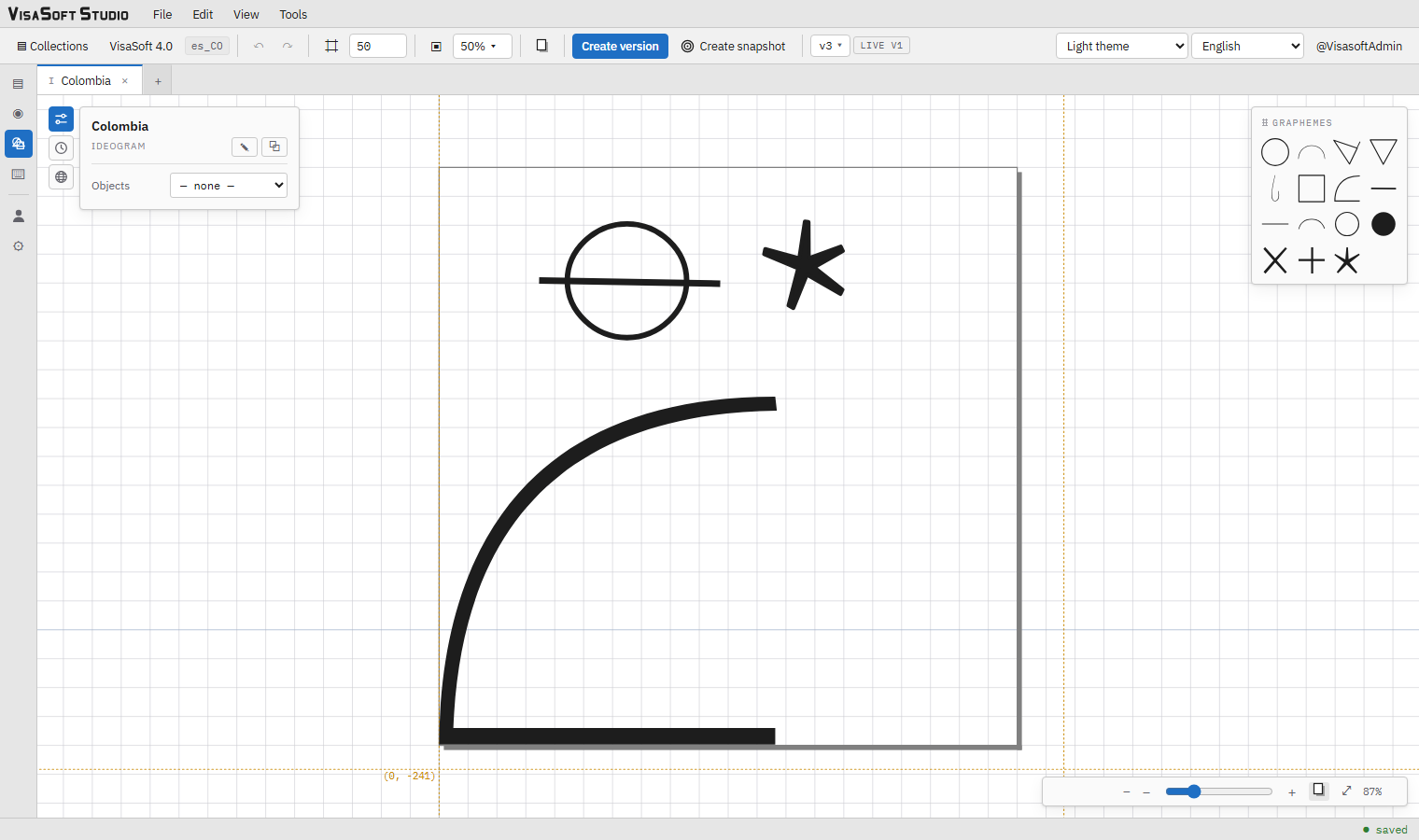
The page button of the toolbar (a sheet with a shadow) draws the glyph page: a square of 1,000 × 1,000 units, the font's em square, with its bottom-left corner 200 units below the origin. So the page runs from −200 to 800 vertically: 80 % above the baseline and a 20 % descender. The page is drawn as a sheet with a shadow, under the ideogram. Whatever you draw inside it will take exactly the body of the text when the font is used; whatever sticks out will invade the neighbouring characters or lines. Font creation explains why this is what matters most when composing.
The frame the page button of the zoom bar centres the view on the whole page. Whether the page is shown is remembered in the browser.
The grid
The ⌗ button shows or hides the grid and the number field next to it sets its step (minimum 5, in steps of 5, default 50). The grid is anchored at the origin and never moves with the objects. It drives snapping: moving with Shift, dragging the rotation centre with Shift, the Shift+←→↑↓ arrows and the context menu's Snap to grid.
Percentile frames

The ▣ button turns on the percentile frames and shows next to it a dropdown with checkboxes for 10, 25, 50, 75, 90, 95, 99 and 100 %, each percentile in its own colour. The P % frame is the smallest rectangle the P % smallest ideograms of the locale fit in (ranked by area): the 50 % frame says where the smaller half of the collection fits, the 100 % frame the whole collection. They are drawn as four dotted lines across the whole view, with a "P % · n/N" label by the top-left corner and the coordinates of the bottom-left and top-right corners.
They are the reference for composing at the usual size: a new ideogram that fits inside the 50 % or 75 % frame will look proportionate next to the others in a text. The frames are computed on the server from the live versions and recomputed only when something changes. The chosen percentiles are remembered in the browser.
Zoom and panning
| Action | How |
|---|---|
| Zoom in / out | Mouse wheel over the canvas (centred on the pointer), the − / + buttons or the slider (from 50 % to 570 % of the fit). |
| Fit to view | ⤢: frames the ideogram as large as the panel allows, with a small margin (8 %) on each side. It is also the initial view on opening: the page fills the available width or height without touching the edge. |
| Frame the page | The page button of the zoom bar (only with the page shown), with the same margin. |
| Pan | Drag the background with Ctrl held, or with the middle mouse button. |
The grapheme toolbox
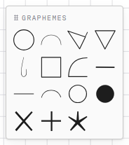
The floating Graphemes box shows one button per grapheme of the collection, in name order, with its localized name on hover. A click adds a reference to the grapheme at the centre of the view, at scale 0.4, and leaves it selected for placing. The box drags by its title and its position is saved in the account. It only appears if you may edit.
Selecting
| Action | Effect |
|---|---|
| Click on a grapheme | Selects it (and only it). |
| Shift + click | Adds or removes the grapheme from the selection. |
| Drag on the background | Marquee selection: the graphemes that fall entirely inside the rectangle are selected. |
| Click on the background | Deselects. |
| Objects list in the panel | Picks a grapheme by number and name; with several selected it shows "n objects selected". |
With one grapheme selected the gizmo appears and the panel shows its properties; with several, each gets an outline and the panel offers mirroring and removing them all.
The gizmo
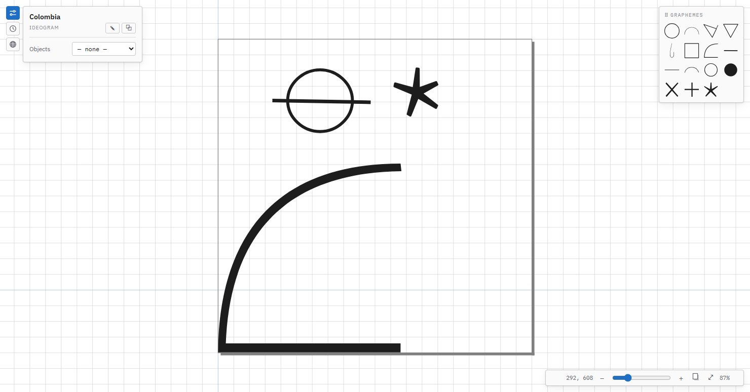
The gizmo is the manipulator around the selected object, drawn in the object's own frame (turned with it):
| Handle | Action |
|---|---|
| Body of the grapheme | Dragging moves. With Shift, the first object snaps to the grid and the others keep their distance. |
| Edge handles (arrows in the middle of each side) | Resize on one axis. |
| Corner handles (squares) | Resize uniformly (same proportion). |
| Rotation handle (circle above the top edge) | Turns around the rotation centre. With Shift, in 15° steps; without, in whole degrees. |
| Rotation centre (cross in a circle) | Dragging moves it (with Shift it snaps to the grid); double-click returns it to the object's origin. It is only stored once moved. |
Handles keep their on-screen size at any zoom. Every manipulation is a single undo step.
Mirroring
Mirror horizontal / vertical reflect each grapheme across the vertical or horizontal line through its rotation centre (the pivot, or the position when it was never moved). A referenced grapheme has no nodes of its own, so its reflection is carried by the sign of the scale on that axis (the original program's convention) together with a negated rotation and a mirrored position; the scale magnitudes do not change. With several selected, each one is reflected about its own centre, which does not move.
Copy, cut and paste
Selected graphemes are copied with Ctrl+C (or Copy in the Edit menu or the context menu), cut with Ctrl+X and pasted with Ctrl+V. What is pasted lands one grid step up and to the right of the original (each further paste of the same content, one step more) and stays selected, ready to be moved. The clipboard is shared by every open tab: copy in one ideogram, paste in another.
Keyboard
With one or more graphemes selected (and the focus outside a text field):
| Key | Effect |
|---|---|
| ← → ↑ ↓ | Moves 1 unit in that direction (Y upwards). |
| Shift + arrow | Moves to the next grid line. |
| Delete or Backspace | Removes the selected graphemes. |
| Ctrl+Z / Ctrl+Y | Undo / redo (also Ctrl+Shift+Z). |
| Ctrl+S | Create version. |
Shortcuts act only on the visible tab.
The context menu
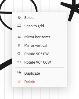
The right button on a grapheme opens the context menu. If the grapheme is part of the selection, it acts on the whole selection; otherwise only on it.
| Option | Effect |
|---|---|
| ↗ Open grapheme | Opens the grapheme in its own editor, on the version this ideogram uses (see opening a grapheme from the ideogram). It is the only entry of the menu when you may only view the collection. |
| Select | Selects only this grapheme. |
| Snap to grid | Moves the object to the nearest grid intersection. |
| Mirror horizontally / Mirror vertically | Flips the sign of the X or Y scale: the grapheme appears mirrored across its own axis (the original program's semantics). |
| Rotate 90° clockwise / counter-clockwise | Adds ∓90° to the rotation. |
| Duplicate | Creates an offset copy (58 units right and down) and selects it. |
| Delete | Removes the grapheme (undoable). |
The properties panel
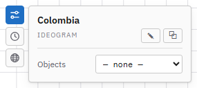
The panel has a small rail with three buttons; one click opens its box and another folds it. The header always shows the ideogram's name and kind, with:
- ✎ Rename: asks for the new name (unique within the locale). The name is the gloss: it is what the keyboard will search.
- ⧉ Clone: opens the new item dialog with a copy of the current state (see collections).
Opening a grapheme from the ideogram
When a grapheme does not sit well in the ideogram, the fix is usually in the grapheme itself. ↗ Open grapheme (in the context menu or under the Objects list) opens the grapheme in a tab of the grapheme editor, and does so on the version this ideogram uses:
- if the ideogram has that version pinned and the grapheme is on another one today, the editor checks that version out (as when choosing it in the version picker: with unversioned changes, the Switch and discard dialog warns first);
- if the ideogram follows the grapheme's current version, it opens as it is now, autosaved edits included.
Back on the ideogram's tab, the grapheme shows the changes you saved, because the ideogram always draws the current state of each grapheme. The grapheme's live version does not change by opening it: what fonts and exports see is still what was promoted.
Ideogram box
- Objects: the list of references ("1 · Face", "2 · Line"…) to select without aiming. Below it, the ↗ Open grapheme button opens the selected grapheme in its editor.
- With a reference selected, under the Grapheme — name title:
| Field | Detail |
|---|---|
| x, y | Position, in font units (integers). |
| scale x, scale y | Scale; must be greater than 0 (an invalid value is ignored). The ⇋ / ⇵ buttons mirror on that axis. |
| rotation | Degrees. |
| thickness × | Multiplies the line thickness of the whole grapheme (default 1; greater than 0). Filled shapes are thickened geometrically. |
| version | live (default) or a specific version of the grapheme (v1, v2… with the live one marked). With a pinned version this ideogram does not change when another version of the grapheme is promoted. |
| rotation centre (x, y) | Only shown once moved; reset returns it to the origin. |
| Remove grapheme | Removes the reference. |
- With several selected: "n objects selected", ⇋ ⇵ to mirror them all and Remove objects.
History box
The ideogram's versions and snapshots; described in Versions and snapshots.
Localized names box
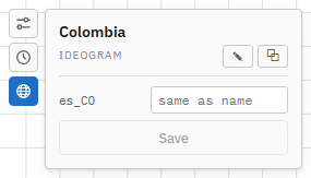
One field per locale of the collection: the name the item will show in that language. Empty, the item's name is used. It is item metadata, not geometry: it is not part of any version or snapshot and is saved with the Save button or with Enter. It is especially useful for graphemes, whose localized names appear in the toolboxes, in the keyboards' palettes and in tooltips.
The toolbar

| Control | Detail |
|---|---|
| ↶ ↷ | Undo and redo the active document. |
| ⌗ and the number field | Grid and step. |
| ▣ and the percentile dropdown | Percentile frames (ideograms only). |
| Page button | Glyph page (ideograms only). |
| Create version | Freezes the current state as a new version; see versions. |
| ◎ Create snapshot | Saves a manual snapshot; see snapshots. |
| v3 ▾ | The version picker: the version you are editing; open, the list with the live and deprecated ones marked; choosing another checks it out in the editor. |
| LIVE / LIVE v1 | Says you are editing the live version or, if not, which one is live. |
The status bar reports saving: saved, unsaved…, saving…, autosaved (a working copy exists on the server) or save failed, and how many tabs have changes not yet sent.
Good practice when composing
- Turn on the page and a percentile frame (50 % or 75 %) before starting: they are the reference for size and position.
- Place the ideogram against the left edge (x = 0) and on the baseline; keep the descender for what really hangs.
- Use thickness × sparingly: the font turns strokes into outlines and an exaggerated thickness closes the gaps.
- Pin a grapheme's version only when an ideogram depends on an old shape; following the live one is the norm.
- Create a version when the ideogram is ready and promote it when it must enter the font. Meanwhile, autosave protects your work and snapshots let you go back.